Most multi-device layout patterns for the Web are designed to rearrange page elements within a visible browser window. Off canvas multi-device layouts, on the other hand, use the space outside a browser’s viewport to hide secondary elements until people need them. Jason Weaver and I put together demonstrations of several new off canvas layout patterns.
Why Off Canvas Layouts?
In my survey of multi-device layouts patterns, I found several common ways to adapt Web page designs to a variety of screen sizes. Across most of these patterns though, small screens got the shaft. That is… a tall scrolling list of all the elements on the page stacked together.
Since many multi-device layout patterns are only considering the visible browser window as their canvas, this situation is pretty much inevitable. On portable devices the screen is intentionally small and the only way to fit a Web page’s content is to stack it up -unless you decide to use the space outside a browser’s visible canvas.
Off canvas layouts do just that. These layouts take advantage of space off the screen to keep content or navigation hidden until either a larger screen size allows it to be visible or someone takes action to expose it. Let’s look at some demos.
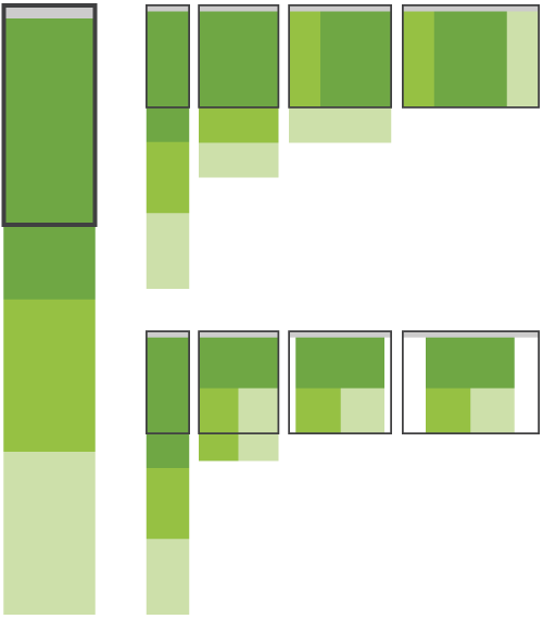
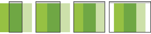
Footer Nav & Off Canvas Column
On large screens, this pattern looks like a pretty typical Web page layout: primary navigation on top, a left-hand column with some supporting information, and a main content area in the middle. As you can see in the diagram below, however, the layout adapts to varying screen sizes in two important ways.
As screen size decreases and we approach typical mobile device widths, the navigation at the top moves to the bottom of the page. This placement works great on modern mobile devices since it provides navigation options for people when they get to the end of content and comfortable touch targets near the bottom of the screen. To ensure people can access this bottom positioned navigation menu quickly, an anchor link shows up at the top of the page providing instant access.
At the same time, the supporting column is moved out of the visible browser window and a link labeled "Extra" appears that allows you to display this off canvas element when you need it. Since this column contains supporting or related information, it gives way to the main content area when screen space is at a premium.
Check out the Footer Nav & Off Canvas Column demo and in action on this site.
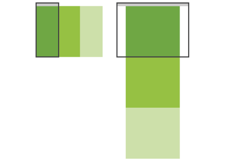
Off Canvas Column & Nav
This pattern also uses a top navigation and two-column layout on large screens but as the diagram below illustrates, it adapts to smaller device widths a bit differently.
As screen size decreases in this pattern, the navigation menu moves off canvas above the content of the page. Once again, a link appears that allows you to smoothly slide the navigation on screen when needed. This time though, the menu appears from the top. While this still provides quick access to navigation, the lack of options at the end of a content page could leave people hanging on mobile devices. As a result, I tend to prefer the footer nav pattern a bit more.
The supporting column of content in this layout also moves off canvas but to the left instead of the top. So we have two off canvas elements when dealing with smaller devices widths -both accessible through links.
Check out the Off Canvas Column & Nav demo.
Combined Off Canvas Column
Like the last two patterns, the combined off canvas column design features a standard top navigation menu and two columns of content on wide screens. When screen width decreases, the content in the supporting column and the navigation menu is combined into one off canvas element.
In the demonstration of this pattern that Jason put together, the supporting column contains several asides. These are combined into a tab-based interface in the off canvas element and placed in between navigation menu links. But, you could combine several page elements in many different ways. The key to this pattern is taking elements from different parts of the wide screen design and combining them into a single off canvas element.
Check out the Off Canvas Column & Nav demo.
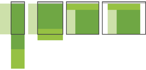
Two Columns Off Canvas
On wide screens this pattern is a standard three-column layout. As screen size decreases, one by one the columns are moved off canvas as the illustration below shows.
On mid-sized screens, only one column is moved off canvas (in this case to the right). On narrow screens, two columns are moved off canvas (to the left and right). Each time a link appears that allows you to smoothly bring the column and it’s contents onto the canvas and into view.
On small screens, this pattern can focus pages with lots of supporting information or navigation on just the main content instead of stacking everything on the page vertically.
Check out the Two Columns Off Canvas demo.
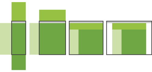
Vertical/Horizontal Off Canvas
The vertical/horizontal off canvas pattern builds on a popular Web design technique: a vertical scrolling page of distinct content sections. Keep scrolling down on these sites to see this design style in action.
Clearly, this approach works best on wide screens. But can we make it adapt elegantly to narrowing screen sizes as well? Enter the vertical/horizontal off canvas pattern. On wide screens, content sections are stacked vertically and you can scroll down to make your way through them. On narrow screens, the vertical layout is flipped 90 degrees. All the content sections after the first one are moved off canvas to the right as the diagram below shows.
To move between the off-canvas content sections on narrow device widths, simply tap the links at the top of the screen. These same links also scroll you down to different content sections on wide screen devices. We’ve also explored allowing people to use swipe gestures to move between the content sections on narrow touch-enabled screens.
Check out the Vertical/Horizontal Off Canvas demo.
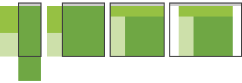
Ajax Vertical/Horizontal Off Canvas
To account for the fact that small screens are often synonymous with mobile devices on low bandwidth connections, we created an Ajax version of the vertical/horizontal pattern. At narrow screen widths, this layout will only load the contents of the first content section and use asynchronous server requests to lazily load the remaining content sections, which are off canvas by default.
With this Ajax implementation, mobile devices are not penalized with downloading all the content-rich sections all at once.
Check out the Ajax Two Columns Off Canvas demo. If you resize your browser down to a small width, you'll need to refresh the page to get the lazy load in place.
More to Come
As more Web designers and developers tackle multi-device layout solutions, I hope we’ll see new techniques shared and discussed. It will be really interesting to see where these new design approaches take us and the Web. So stay tuned…
Special thanks to Jason Weaver for building these demonstrations and helping push them forward.