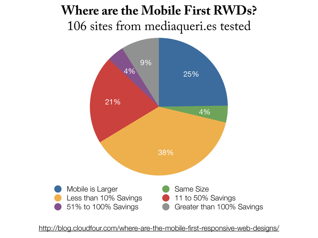
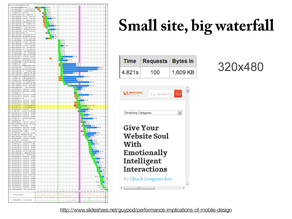
Size Less than 10% Savings 11 to 50% Savings 51% to 100% Savings Greater than 100% Savings Where are the Mobile First RWDs? 106 sites from mediaqueri.es tested http://blog.cloudfour.com/where-are-the-mobile-first-responsive-web-designs/
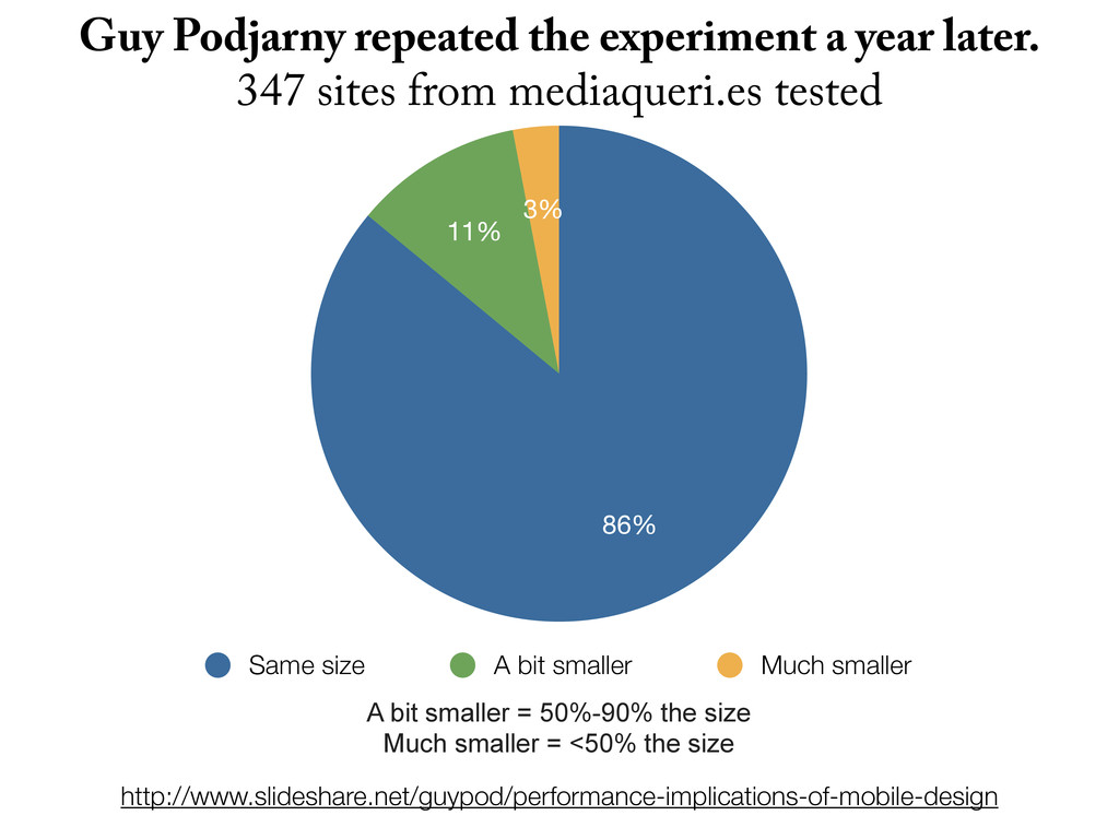
smaller Guy Podjarny repeated the experiment a year later. 347 sites from mediaqueri.es tested A bit smaller = 50%-90% the size Much smaller = <50% the size
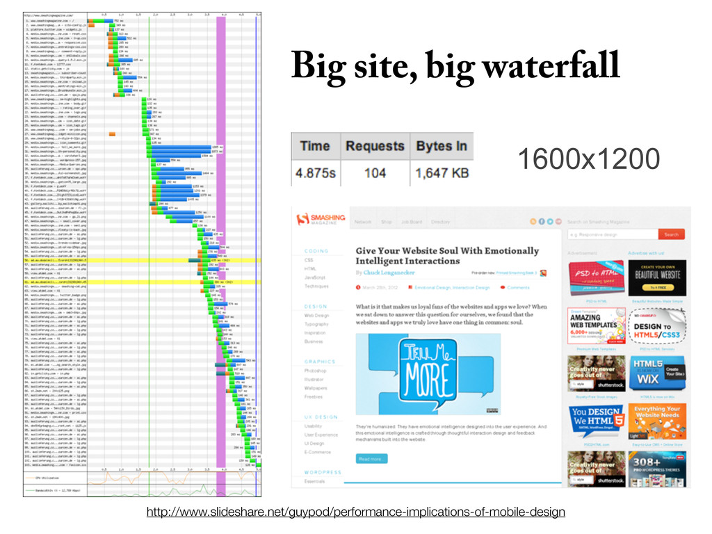
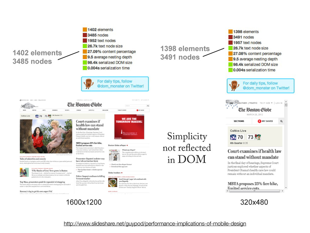
3485 nodes 1398 elements 3491 nodes http://www.slideshare.net/guypod/performance-implications-of-mobile-design ank you to Guy for letting me use his slides and data!
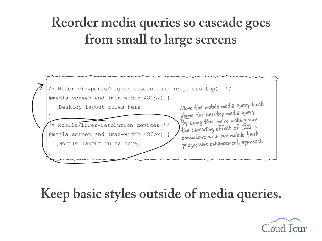
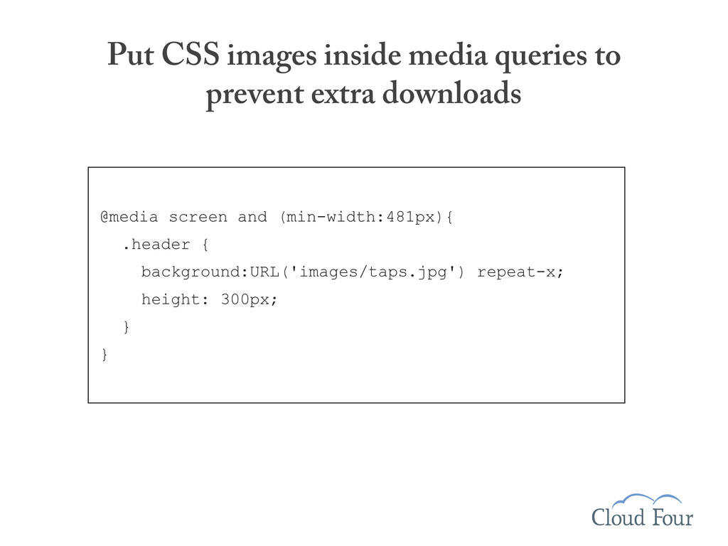
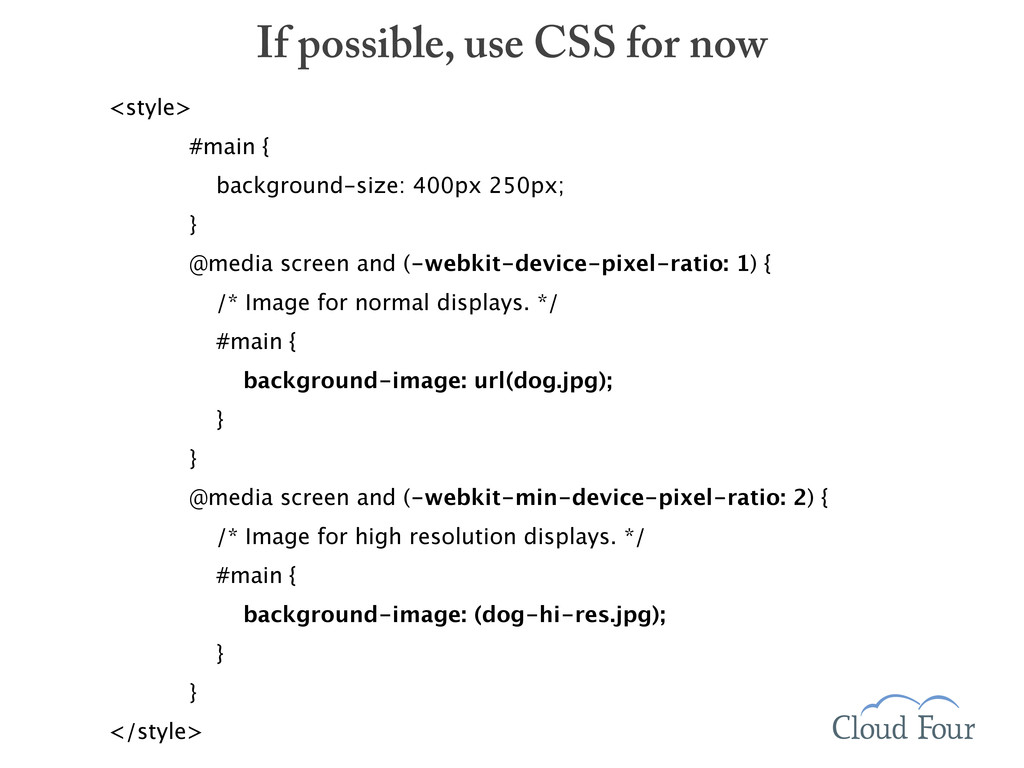
(min-width:481px) { [Desktop layout rules here] } /* Mobile/lower-resolution devices */ @media screen and (max-width:480px) { [Mobile layout rules here] } Move the mobile media query block above the desktop media query. By doing this, we’re making sure the cascading effect of CSS is consistent with our mobile first progressive enhancement approach. Reorder media queries so cascade goes from small to large screens Keep basic styles outside of media queries.
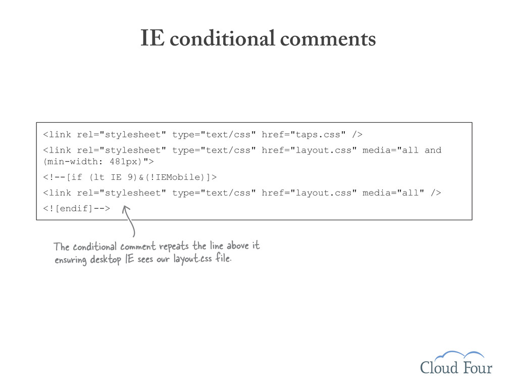
and (min-width: 481px)"> <!--[if (lt IE 9)&(!IEMobile)]> <link rel="stylesheet" type="text/css" href="layout.css" media="all" /> <![endif]--> The conditional comment repeats the line above it ensuring desktop IE sees our layout.css file. IE conditional comments or use Respond.js (a media query poly ll for IE)
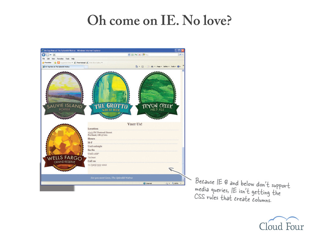
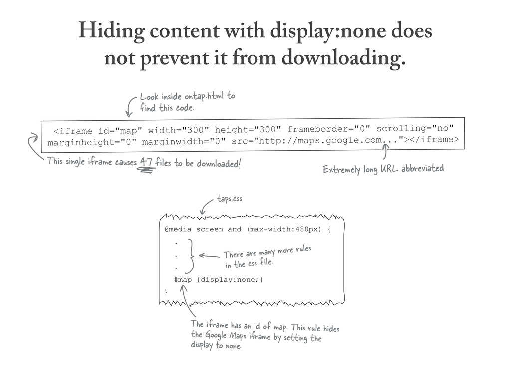
long URL abbreviated This single iframe causes 47 files to be downloaded! Look inside ontap.html to find this code. Hiding content with display:none does not prevent it from downloading.
long URL abbreviated This single iframe causes 47 files to be downloaded! Look inside ontap.html to find this code. @media screen and (max-width:480px) { . . . #map {display:none;} } taps.css There are many more rules in the css file. The iframe has an id of map. This rule hides the Google Maps iframe by setting the display to none. Hiding content with display:none does not prevent it from downloading.
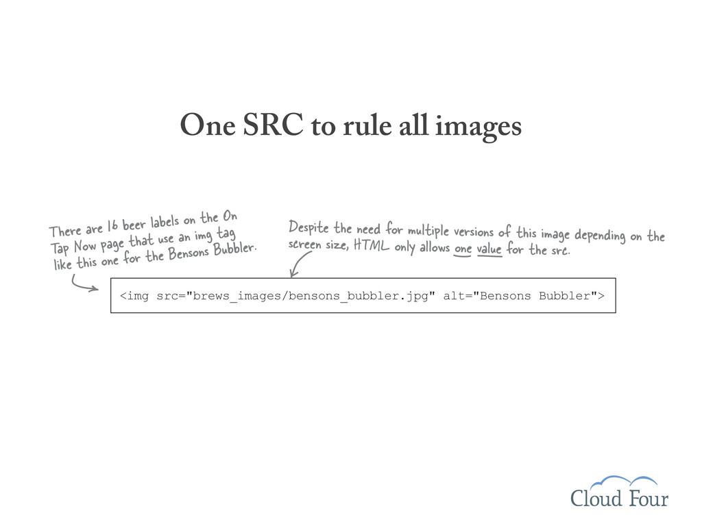
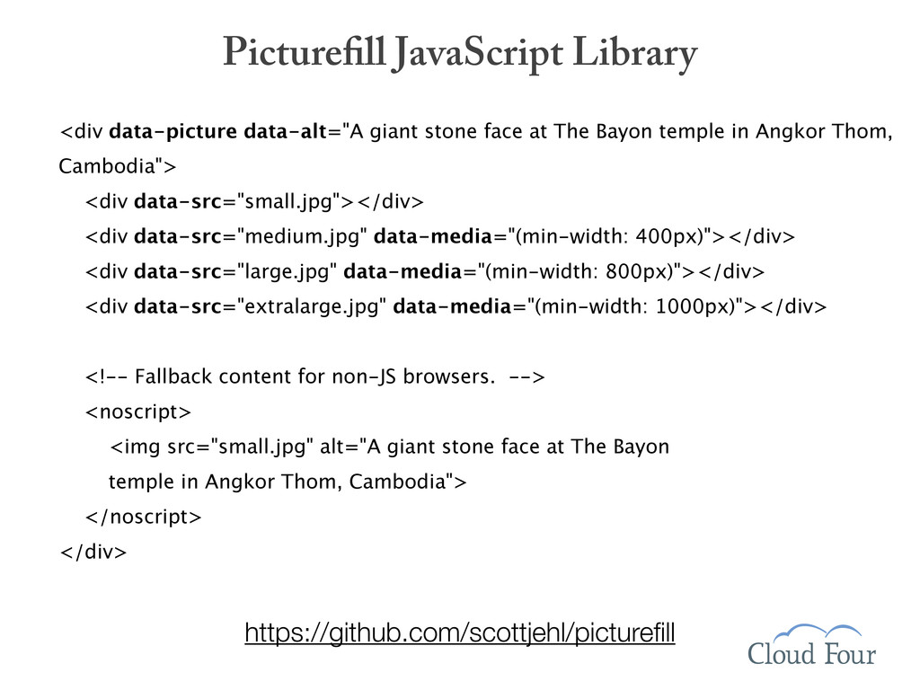
There are 16 beer labels on the On Tap Now page that use an img tag like this one for the Bensons Bubbler. Despite the need for multiple versions of this image depending on the screen size, HTML only allows one value for the src.
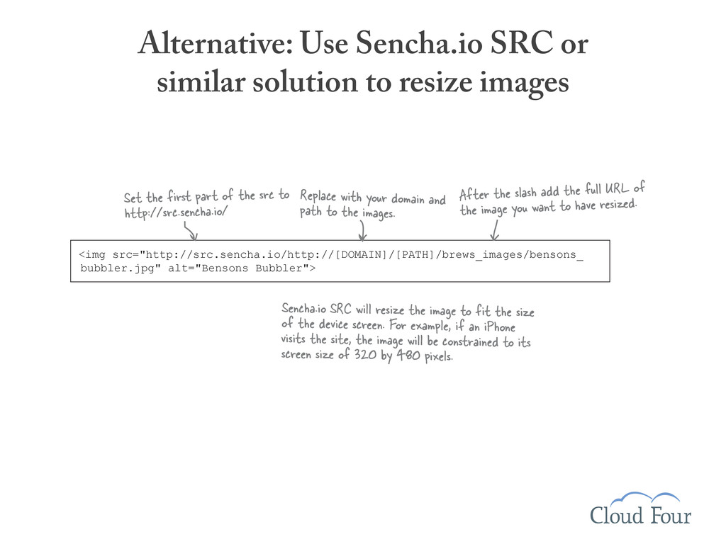
Set the first part of the src to http://src.sencha.io/ After the slash add the full URL of the image you want to have resized. Sencha.io SRC will resize the image to fit the size of the device screen. For example, if an iPhone visits the site, the image will be constrained to its screen size of 320 by 480 pixels. <img src="http://src.sencha.io/http://[DOMAIN]/[PATH]/brews_images/bensons_ bubbler.jpg" alt="Bensons Bubbler"> Replace with your domain and path to the images.
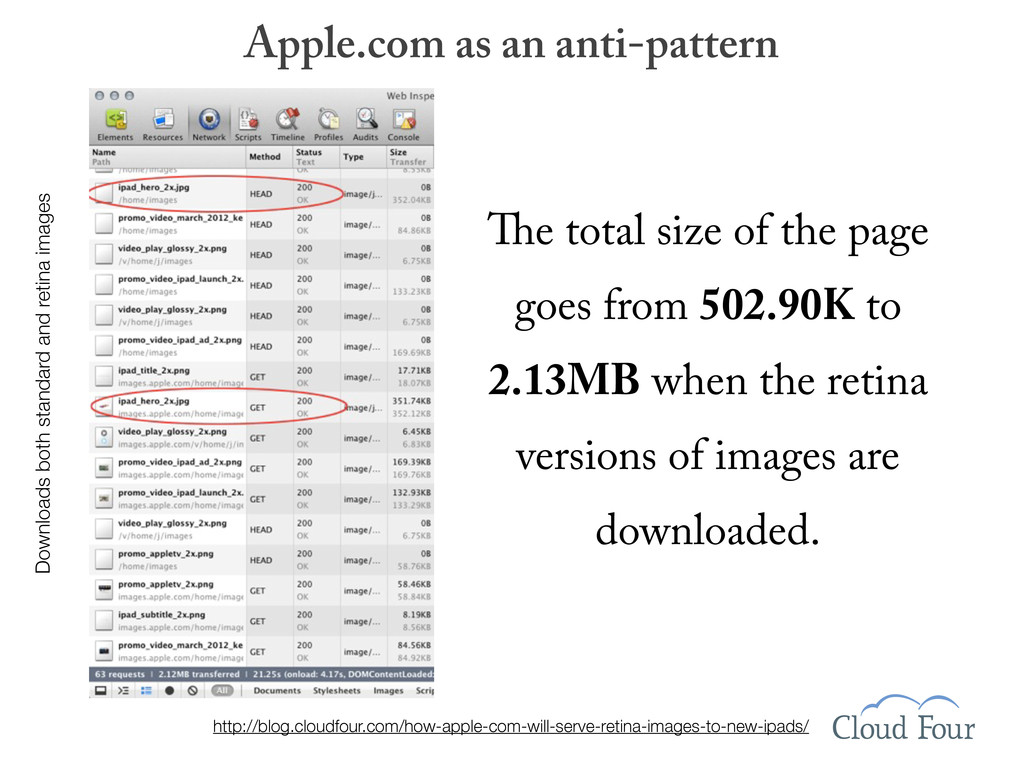
e total size of the page goes from 502.90K to 2.13MB when the retina versions of images are downloaded. http://blog.cloudfour.com/how-apple-com-will-serve-retina-images-to-new-ipads/
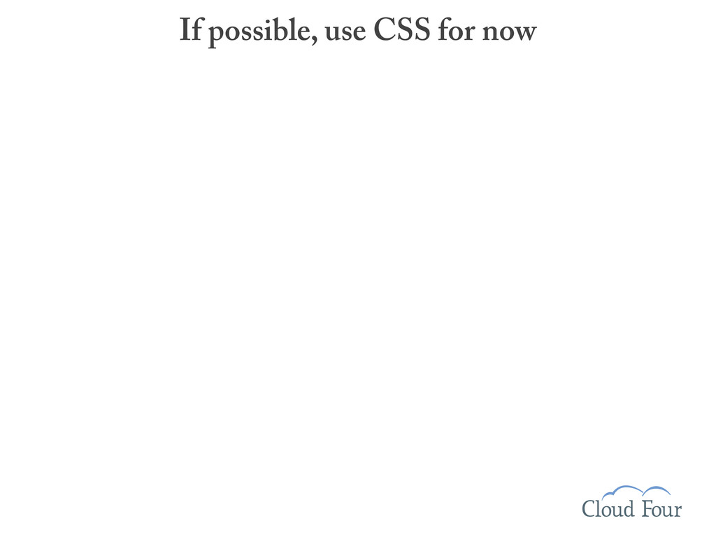
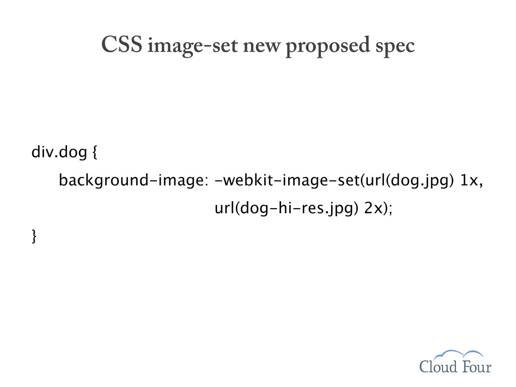
(-webkit-device-pixel-ratio: 1) { /* Image for normal displays. */ #main { background-image: url(dog.jpg); } } @media screen and (-webkit-min-device-pixel-ratio: 2) { /* Image for high resolution displays. */ #main { background-image: (dog-hi-res.jpg); } } </style> If possible, use CSS for now
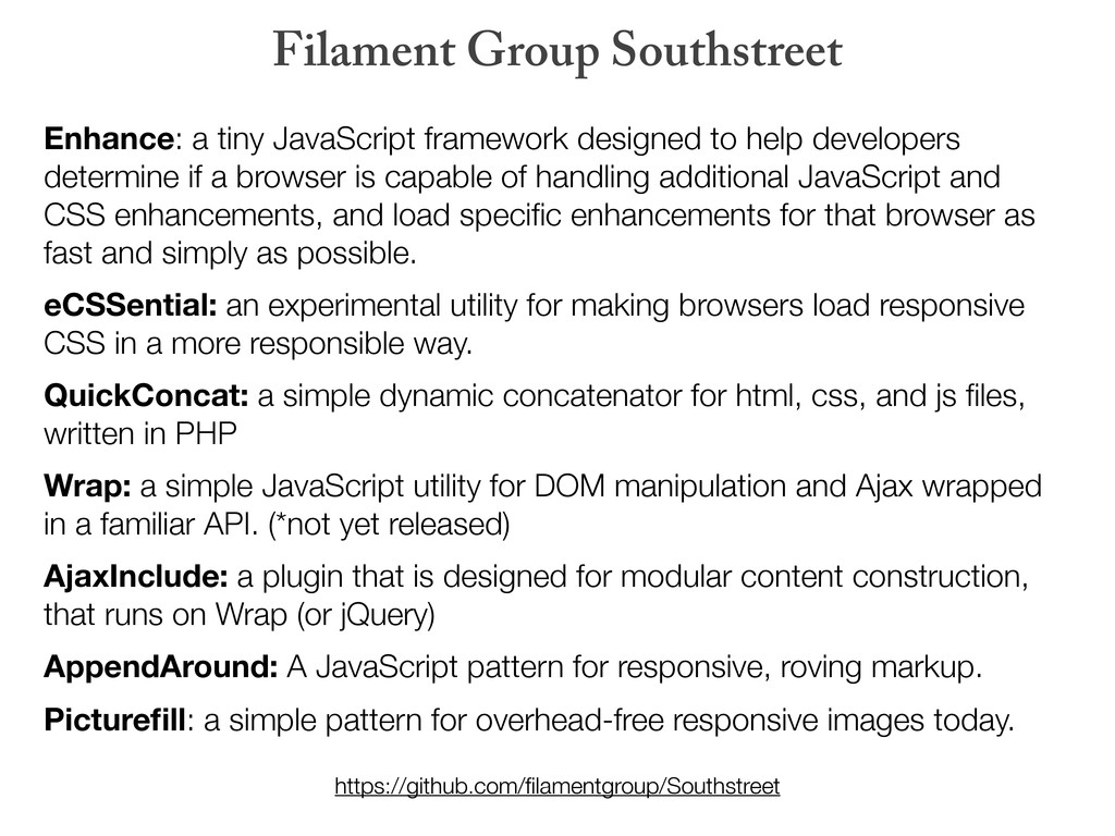
if a browser is capable of handling additional JavaScript and CSS enhancements, and load specific enhancements for that browser as fast and simply as possible. eCSSential: an experimental utility for making browsers load responsive CSS in a more responsible way. QuickConcat: a simple dynamic concatenator for html, css, and js files, written in PHP Wrap: a simple JavaScript utility for DOM manipulation and Ajax wrapped in a familiar API. (*not yet released) AjaxInclude: a plugin that is designed for modular content construction, that runs on Wrap (or jQuery) AppendAround: A JavaScript pattern for responsive, roving markup. Picturefill: a simple pattern for overhead-free responsive images today. Filament Group Southstreet https://github.com/filamentgroup/Southstreet
 grigs
grigs
 infiniteloop_inc
 mitsuzono
 yu4u
yu4u
 miyakemito
 thomasvitale
 koki_nishihara
 dayjournal
 aeonpeople
 8maki
8maki
 __allllllllez__
 kongmingstrap
 chibiegg
 destraynor
 speakerdeck
 sugarenia
 akmur
akmur
 jacobian
 chrislema
 dotmariusz
 kastner
 palkan
 panda_program
 bermonpainter
 smashingmag